Is your website responsive? | Responsive WordPress
Your website should look good for your visitors and customers at all times. Don’t you agree? Not only does this require rock-solid WordPress Hosting, but also a properly coded website.
Have you ever loaded a website on your cell phone and had a very poor experience? Maybe the white text displayed on a white background making it unreadable, or maybe a slideshow failed to load. Regardless, I feel confident that we have all experienced a non-responsive website at some point in time.
What is Responsive Website Design?
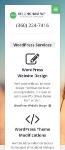
A responsive website design is coded in a way so that its layout is adjusted based on the screen size and resolution of the device that is viewing it.
Here is an example of what I’m talking about:
When a website is viewed on a cell phone or other mobile device, it should still be easy for the user to read, navigate, and use. This is considered to be an aspect of User Experience design.
A good test would be to load your company’s website on your smart phone right now. Ask anyone else in the office to do the same and see what displays. If issues are discovered they should be brought to the attention of your web developer or designer.
As always, if you need help making your WordPress website responsive, please get in touch.


